40 Years of the American Death Penalty

For the second project in our interactive data visualization class we were tasked with creating a narrative visualization. I ended up explaining the history of the death penalty. Here is how I created that project, from choosing a topic all the way to writing the code.
Step 1: Ideation
There were many topics that were of interest to me for this project. I first wanted to do my project on different types of natural resources and examine where those natural resources came from, and where they are used in our day to day lives. After watching an episode of Dirty Money on how drug traffickers used gold as a way to cash in on the drugs they sell to America, my idea slowly shifted towards a focus on gold and drugs. I unfortunately could not find any data on this, and I also was running out of time, so I decided to shift directions again.
I spent a whole entire day going through this great database of datasets put together by Jeremy Singer. If you ever are looking for a dataset or you have no idea what kind of data is out there, this is a great place to go. I ended up finding a dataset that contained the final statements of death row inmates before they were executed. As I was going through that dataset, I came across a statement by one of the inmates that mentioned a quote from Coretta Scott King. The quote went like this: “Justice has never advanced by taking a life”. That quote validated just exactly how I and most likely a majority of individuals, felt about the death penalty. But why then does America still continue to execute people? Is the death penalty effective at reducing crime? It is fairly and objectively assigned?
I had strong feeling that I already knew the answers to those questions, but I wanted to visualize it with data. Along with the dataset on final statements, there was also a dataset that contained data on individuals who were sentenced to death. That data contained the year that individual was sentenced, their race, the state in which they were sentenced, and their current status (had they been executed, were they still on death row, were they exonerated, etc). This dataset was collected by The Intercept and along with that dataset, they had done some great articles that highlighted the history of the death penalty. Although the number of individual’s sentenced to death over the past 40 years has dramatically decreased, many of the individuals who were sentenced had their original sentence corrected, showing that the system was flawed to begin with. What they also found was that in some states, such as Texas, individuals of color were sentenced far more than individuals who were White. With all of this, I felt like I could begin to put together my project.
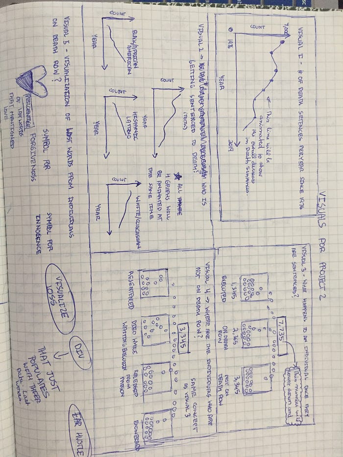
Step 2: Design/Sketches
I knew that I wanted to create some version of a scroll driven graphic. But I first needed to figure out how the narrative would develop and also identify the key insights that needed to be included in each section. Now I usually would have found those insights by doing some analysis on the data, but by reading the articles done by The Intercept and looking at some of their insights, I was able to put together a basic outline using those insights.
Part 1: How did the “Modern Era” of the Death Penalty come to be?
I first wanted to have an introductory section that explained how the “modern era” of the death penalty came to be. A section that talked about the supreme court decision that started it all.
Part 2: Number of individuals sentenced by year
I wanted the following section to include a graph that showed the number of death sentences administered since 1976 until 2019. The graph would show the overall decline in number of sentences (based off insights from Intercept articles). I wanted to highlight that although that number has gone down over the years, this was not the full picture and fully did not represent that the death penalty was on its way out.
Part 3: Number of individuals sentenced by year and by race
Another one of the key insights mentioned in the Intercept article was the role raced played in the death penalty and how individuals of color were getting sentenced more than individuals who were white in certain states. I made the assumption that this would also be the case nationally. So I wanted this section to include a line graph that would include the number of individuals sentenced by year and by race. Now I’ll get to talking about this later on in the article but when I graphed these numbers I was initially surprised by what I saw.
Part 4: Breakdown of Status of individuals who were sentenced
This next visualization would show the status of individuals who were sentenced. Each individual who was sentenced would fall under one of these three categories: Not Currently on Death Row, On Death Row, or Executed. The numbers and The Intercept article showed that the majority of the individuals that were sentenced were “Not Currently on Death Row” anymore, meaning they were exonerated, released from prison, had their sentence reduced to life in prison, or that they had died. The fact that the majority of the individuals were not not currently on death row, highlighted the fact that the death penalty system was flawed in the first place.
Part 5: Final Statements of Individuals before they were executed
I wanted to figure out how to include these statements somehow in my visual. I knew that I wanted to end with these statements but I just didn’t know how to visualize the text. The last thing I wanted to use was a word cloud. During a brainstorming session with the class, when I was describing my project to a classmate, they had recommended to not visualize the words at all, and to let the words speak for themselves. I loved that idea cause that was how I began this project. The words of these individuals were so powerful and truly do speak to all the horrible facets of the death penalty. Many speak of forgiveness, peace, and of love. Others statements were of those who were wrongly convicted. And many others spoke to the pain felt by family members. No graph or chart could express those emotions like words could, so i decided to display the words as is and let the user explore the range of statements provided in the dataset.
Step 3: Some Simple Data Analysis
I didn’t have to do that much cleaning of the data. The only data analysis that I had to do was some basic grouping and summing of specific categories. What I needed was a breakdown of status for each individual in the data set. I used pandas value_counts() function to do this.

For each status category (“Not Currently on Death Row”, “On Death Row”, Executed) I wanted to get a breakdown of race. For that I filtered the original data frame based on status and then used pandas value_counts function on the race field.


Step 4: The Code
Before I get into the code for each of components, I first had to figure how to make the scroll mechanism work. I also had to figure out how to animate elements, make other elements appear and disappear based on the section of text you were on. Luckily I had these two great examples to help me through it. To implement scrolling, I used the scrollamma.js library and this amazing tutorial by Russell Goldenberg. But then I had to figure out how to create the functionality in my application so that on scroll, elements would disappear, animate, and appear. I was only able to do this with the help of this great example by Cuthbert Chow. TLDR version of that article: You have to draw all your elements first but make the opacity 0 and then transition them to an opacity of 1 when a specific text crosses a threshold set by the scrollama library.
I originally wanted to start with some historical context around how the modern era of the death penalty began, but based on some feedback from class mates, I was encouraged to start with the final statement that caught my attention in the first place (the one that mentioned the Coretta Scott King quote). I thought that was a great idea but I didn’t want to just have the text be displayed. I wanted the text to have an animated typewriter effect when the user first entered the page, so that it gave the effect that the individual was actually typing it. I used this stack overflow example to make it work.
The next component that I needed to visualize was my first line graph. But again I didn’t want to display it. I wanted the line to animate over time to emphasize that trend. Creating the line graph was easy. It was figuring out how to animate it that was a little difficult, but this example and this example both proved to be very helpful. I used this same mechanism for my second line graph that showed the change in number of sentences by race.
I did however have to make the following design decision for my race line graph. I had three options. The first option was to display each line for each race on the same graph as the total sentences. The second option was to keep the total sentences line graph on separate graph and then keep all three lines for each race on another graph. My last option was to keep each race on a separate graph.

I ultimately ended up going with a variation of option 2. I decided to keep each race on the same line graph and separate it from the total sentences line graph that I started with. The reason I did that was because if I had kept each race on a separate graph, a user would not be able to easily compare each line as they animated. If I had kept it on the same graph as total sentences, there would have been too much going on and I was afraid the user would get confused. When I created the visualization I was surprised to see that for the majority of the years individuals of color were being sentenced less than those who were white. I had assumed it would follow what the Intercept had found, that individuals of color were getting sentenced more.

I went back to the data and found that the majority of the individuals that were in the dataset were white, followed by black and then hispanic. That was one reason my graph showed individuals who were white were getting sentenced more. I decided to leave this graph in and not include the visualization by state. One reason was time. I was focused so much on the other graphs that I never really had time to come back and create a state visualization graph. I decided to leave it in but in the text I left in the specific stats that explain this trend on the state level that Intercept sighted in their article.
For my last chart, I had to figure out a way to visualize the status of individuals who were sentenced to death. My reach goal was to create something similar to this NYT graphic.

This type of visual was able to convey the magnitude of the problem and I wanted to recreate that. Each circle in my visual would represent an individual that was sentenced. Shoutouts to my professor for helping me reverse engineer this. We figured out that this was a simple Sankey diagram and all the circles were animated on a canvas element. I got so close to replicating this using this example but I never could get the circles to stop moving. They were running on an infinite loop and would still be moving if I was on another section of the visualization. Also the number of particles that were moving did not match up with how many data points I had. Because I was also pressed for time, I decided to scrap this idea and go back to the drawing board. I decided to use a simple circle packing diagram. This is what it ended up looking like.

Each of the white circles represented the status and each of the red circles represented the race. I also decided to add in a hover over feature, so that when you hover over a red circle, you can see the count of for that specific race.
As mentioned in the previous section I wanted to end with final statements. Instead of just displaying them, I again wanted to give each statement an animated typewriter effect. I added in a “Read” button that a user could click on to read a statement. When the button was clicked a random statement would be chosen from the dataset to be displayed.
Step 5: Feedback Session
Like my first project, I didn’t have too much to show except for a simple prototype. Some of the animations worked but not all of them were ready. The first piece of feedback that I implemented was to start and end with the final statements. By doing so, the visualization mirrored how I became interested in the project. The second piece of feedback that I implemented was to just display the final statements as is and not visualize them in any graph or chart. Doing so let the words speak for themselves and brought some humanity back to the numbers and graphs used earlier on in the visualization.
Conclusion
I definitely would like to go back and try my luck with a few things. If I had time I would go back and add in a visualization of the number sentences based on state and race and year. I would also go back and try my luck with that animated sankey diagram. One last thing that I would fix is the animated typewriter effect on my last section in the visual. You will find that when you click the read button, statements with more than one line all start animating at the same time. They don’t animate one after the other. I never got around to fixing it but would like to update it for next time.
This project was an amazing learning experience. It allowed me to try different visualization techniques, new libraries, mess around with animation and so much more. Here is a simple list of everything I learned doing this project.
- How to implement scroll driven graphics and animations using Scrollama.js
- Animating path elements and text elements
- Use of the d3’s tween() function
- Narrative flow
- Using a flex layout in css
- Trying to reverse engineer a graph example by inspecting the DOM.